Ascent Wallpaper
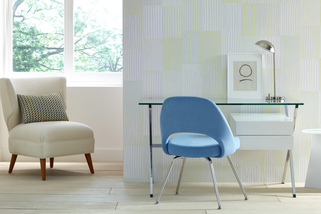
Ascent, The Fields Collection
KnollTextiles
Timeline
March - September 2020
Location
Brooklyn, NY
Role
Designer
Tools
Carving tools, ArtGum erasers, Ink pads,
Photoshop, Illustrator, Caldera, HP Latex 335 Printer
Partners & Collaborators
Kaijie Chen, Designer of ‘Traverse’
Alexandra Karamallis, Design Director & Designer of ‘Expanse’
Project Overview
KnollTextiles reached out to Calico Wallpaper to create a set of wallpapers that were designed to be traditional repeats but felt like signature Calico non-repeating murals. Even though this was going into my 5th year working as now a Senior Designer at a wallpaper company, this was the first time I had worked on developing a repeat pattern. After developing 10 different styles, 3 were ultimately picked; one of my patterns, Ascent, was one of them. All 3 styles were developed into The Fields Collection, now available for purchase on KnollTextile’s website.
Select Press
design centre︎︎︎ office insight︎︎︎
All final installation photos by KnollTextiles
All process photos by Emily Kim

Objective
Despite working as a designer for a wallpaper company, this project was the first time I worked on designing a repeat pattern. The main challenges were:
- learn how to design a repeat unit
- edit the repeat to look as mural-like as possible (try and hide or make less obvious the repeat unit)
- design for another client (KnollTextiles) where final edits were being made externally
Motif Process
In sticking with Calico development traditions, the artwork for this collection was initially created by hand, then translated digitally. For my pattern, Ascent, I was thinking a lot about block printing and linocuts. I was working daily with clay outside of work, and I wanted to find a way to incorporate a more three-dimensional aspect to the work.
Going through the art supplies in the studio, I ended up carving a series of 6 different ArtGum erasers and linoleum blocks into similar linear patterns. The difference between each stamp was mostly due to the scale at which I was working - ArtGum erasers are 2” long x 1” wide.
![]()
![]()
(Left) Carving rubber stamps
(Right) Stamps used with progressively less ink
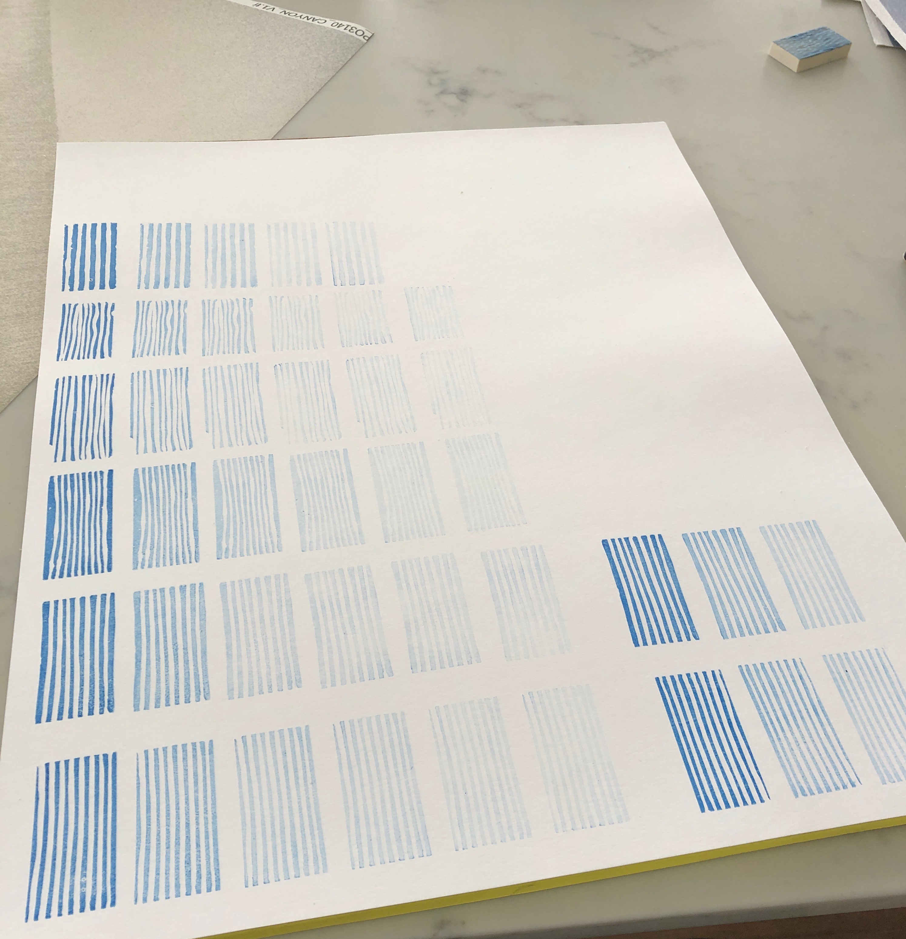
(Left) Carving rubber stamps
(Right) Stamps used with progressively less ink
Pattern Development
But how do you turn 6 line-cut eraser prints into a pattern? Using an ink pad to apply color to the “stamps”, I noticed that each application became noticeably less and less vibrant, but in a way that was really compelling. After many rounds of development, we landed on focusing on a way to put these “stamps” next to one another in such a way that a singular repeat unit wasn’t made so glaringly obvious, and would allow for a more seamless or mural-like effect.
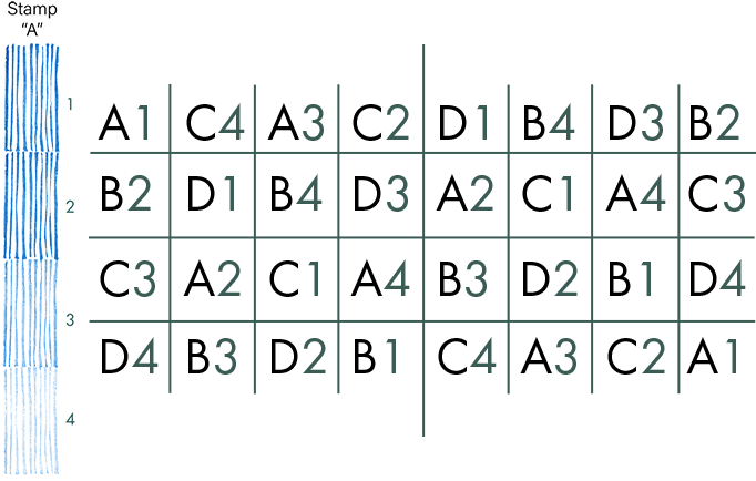
To most efficiently work with the stamps, I created identifiers for each one. Each physical stamp was assigned a letter, and each slightly less saturated iteration of that physical stamp was given a number. From there I created a series of matrices before mocking up any visuals, allowing me to start with more promising variations amongst pattern and saturation and tweaking from there.
The Power of Scale
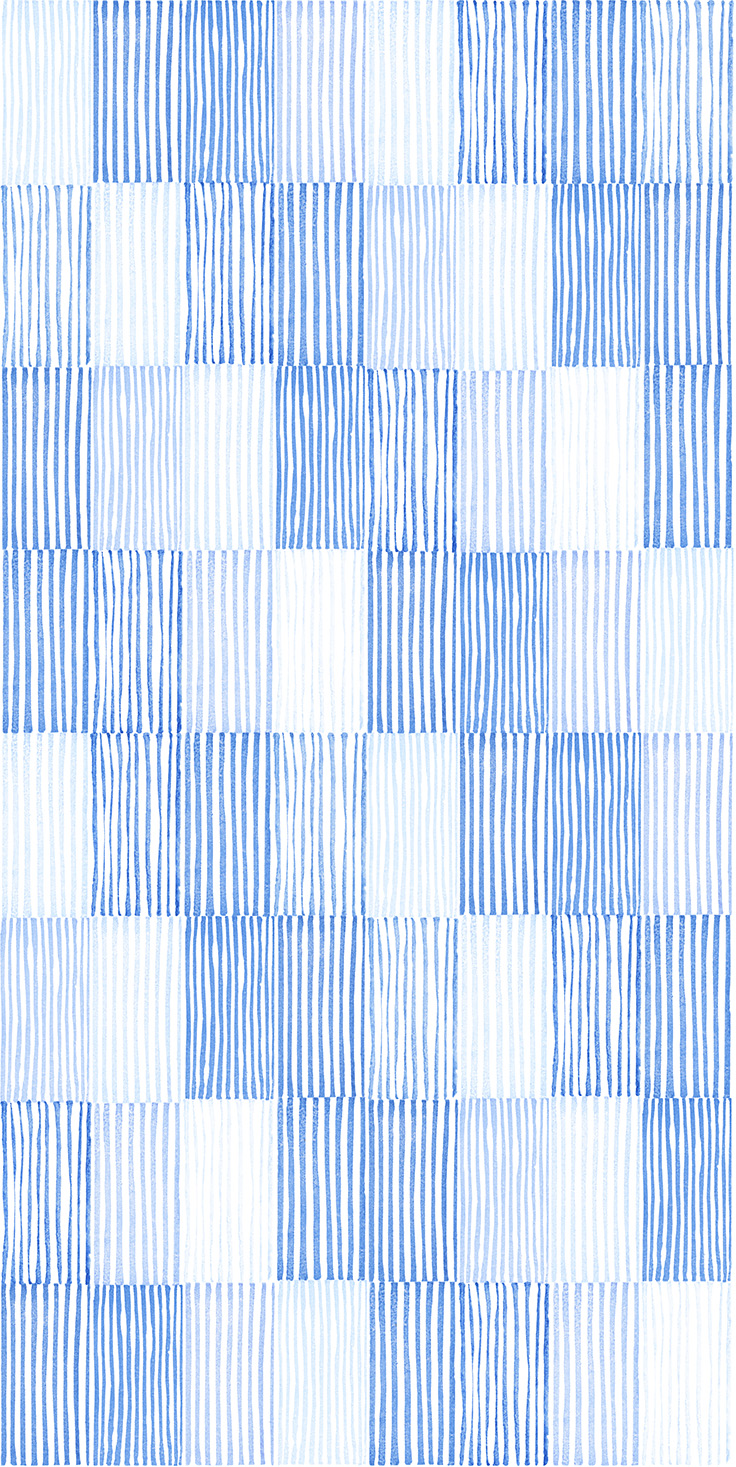
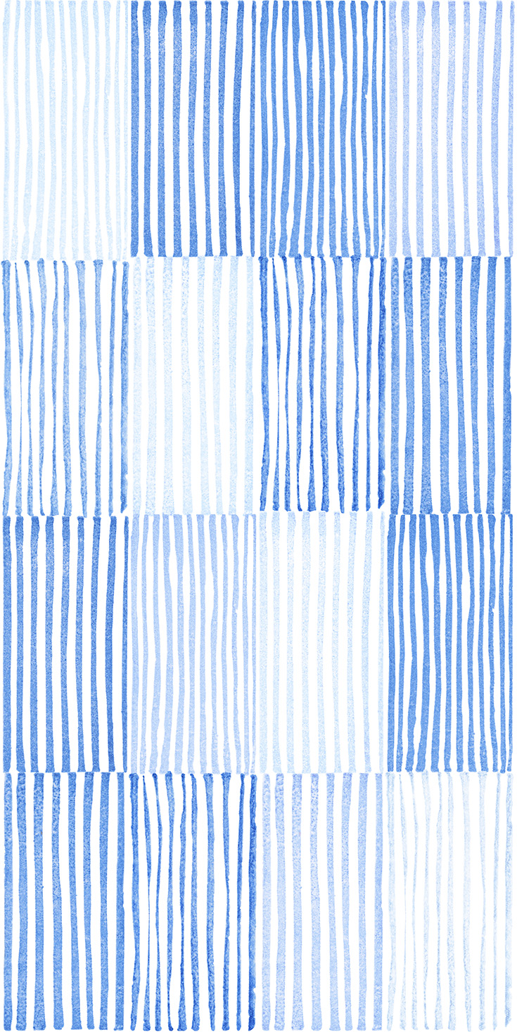
Above are examples of singular repeat units at different scales:
each “stamp” at a smaller scale (left) and larger scale (right).
each “stamp” at a smaller scale (left) and larger scale (right).
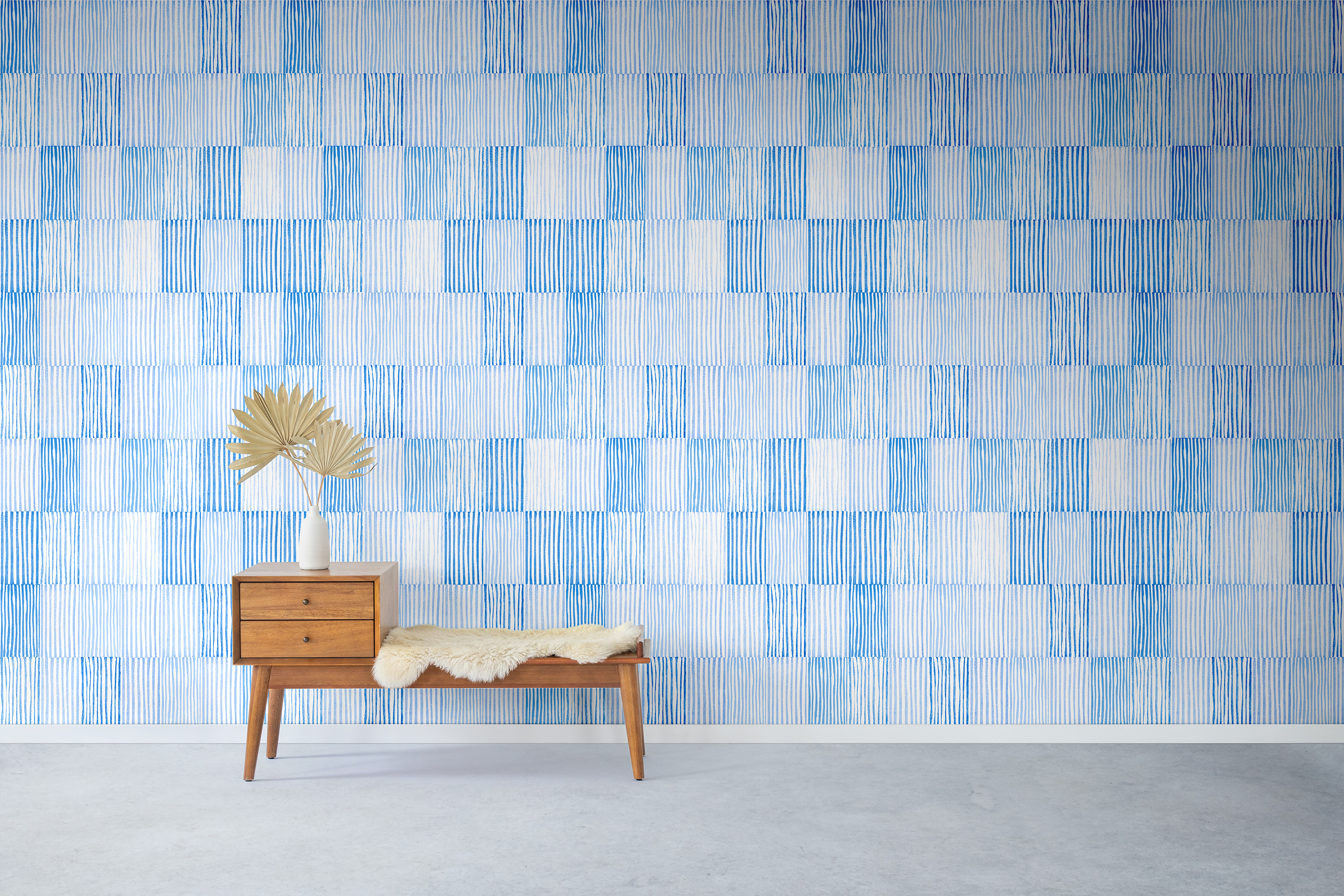 Rendering of the wallpaper with final scale
Final wallpaper installed
 Final colorways - wallpaper samples
© 2022 Emily Kim
